As a developer who sometimes dabbles in designs, I can’t even begin to describe how sick I am of rectangles. Because of the limitations of CSS, almost everything in websites is wrapped in a rectangle that is wrapped in other rectangles. Even designs that incorporate circular images and content wrappers align them in rectangular grids. The css clip-path property will help somewhat, allowing rectangles to be masked into other shapes, but the fundamental grid remains rectangular. Until now.
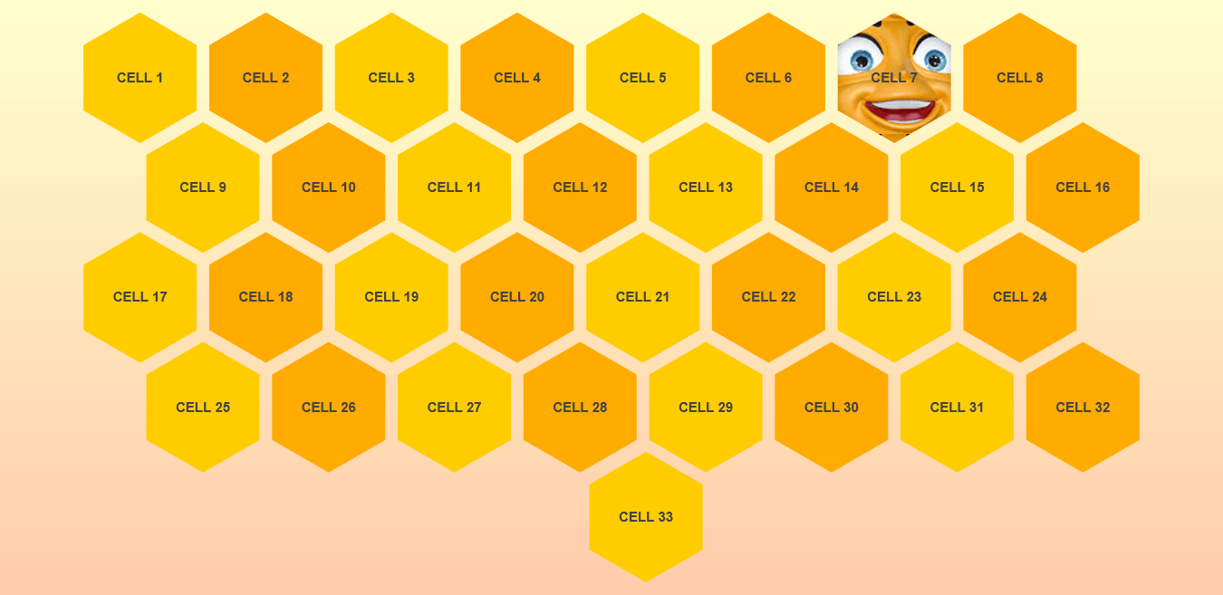
I set myself a challenge this week, to implement a non-rectangular, responsive, tessellating grid in CSS, with as little JavaScript involved as possible. Because I wanted something achievable (simple shape, not requiring multiple alternating shapes or changes in orientation), and because I like honeycombs, I decided to start with Hexagons.
The first challenge was making the hexagon shaped cell. There are a few different ways to do this, each with their own strengths and shortcomings:
- The CSS clip-path property – This would certainly be the easiest, most standards compliant option, but it isn’t supported in current versions of Edge or in IE11, which is sadly still relevant to many users.
- Rectangle with pseudo-elements – Using the before and after pseudo-elements to create triangles that attach to a rectangular div to form a hexagon is a pretty good trick that requires minimal markup. However, because the hexagon is made from three separate DOM entities, you cannot assign a background image to a hexagon without a lot of very fiddly graphics editing.
- Transparent hexagonal background image – You can only control background color by producing different images. Not very modern or performance-minded
- Nested Transforms – This is the method I chose to use in my example. It adds significant non-semantic HTML markup, and requires use of
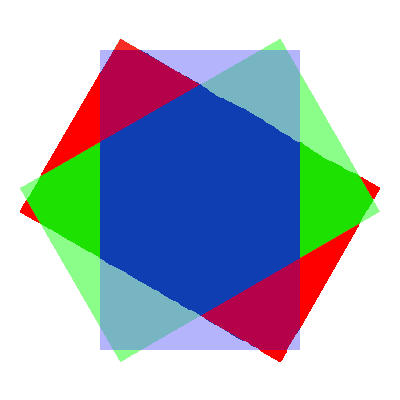
overflow:hidden, so it can be difficult to implement modals or tooltips inside cells, but it allows for both background colors and images, and supports all modern browsers and even IE11. Basically, there is an outer wrapping element, with an aspect ratio of 1:2 that is rotated -120deg and given overflow hidden. Next there is an inner wrapping element that is set to the same dimensions and overflow, but is rotated 60deg. Finally the element itself has the same dimensions and overflow, and again is rotated 60deg.

Next, I used flex-wrap and justify-content to break the hexagonal cells into rows, and used negative margins to overlap the rows as needed.
Then I needed to offset odd and even rows, to line up the honeycomb. Since there is no way to target specific rows of wrapped content, using CSS, I wrote a small javascript snippet that identifies the odd and even rows, and shifts them left and right, accordingly, to make the grid line up (using a class added to each cell). For a non-responsive honeycomb, you could simply add the classes manually and not add the JavaScript, but I wanted to be able to match the width of the viewport.
So, Here is the finished demo (built with SCSS and PUG for simpler markup):
See the Pen Responsive Honeycomb by Greg Schoppe (@gschoppe) on CodePen.0
(https://codepen.io/gschoppe/pen/NBaELE)
Unfortunately, there are a few caveats still associated with this grid.
- I have not yet figured out a good way to add a border to each cell, without building a second set of hexagons under the first
- Content has a tendency to overflow, into the hidden area of the original rectangle, unless an additional inner element is added to jail the content
- Depending on browser, gap between cells, and size of cells, the cell spacing can get slightly uneven on the lower rows
- Overlays like modals and tooltips are hard to attach to cells
- The rotation method of creating hexagons requires two non-semantic nesting elements per cell. So it is not the prettiest HTML.
If you use this layout on a site, or figure out a neat way to extend it, let me know in the comments below!